Sunday, March 17, 2013

More Marbled Paper: Lots of Color

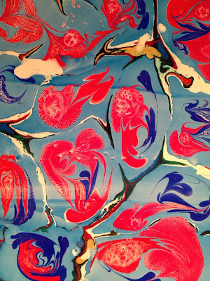
I've done three marbling sessions since my last post. The photo (above) is one from the very last session - I like it a lot. I love the colors and I love the shapes: circles and loops/hoops.

For the first batch (of the three) I used week-old size and didn't have much success. It looked like the paint was cracked all over, rather than covering the size smoothly. It's hard to see here, but this one was on a light blue Strathmore charcoal paper. It looks washed out to me, because it doesn't have the white paper as the background to make the colors stand out. I won't repeat using that colored paper anytime soon.
Another one from that first batch:
I think this one is pretty with all the orange and pink and dark blue. Plus I like the lines. I especially like how the yellow/orange/red turned out:
This was just a pull of some of the left over of the above, which is why it only covered half the page:
After that, I made some new size (using carageenan) but realized after pouring it from the blender to the tray that half the carageenan powder was stuck to the side of the blender. I used the size after letting it sit for only a few hours in the refrigerator. I also alumed up a bunch of Masa White on the smooth side, which is what I used for the last two batches. I like this pink/red one the most. But look closely at it - the paint is all feathered when I really want it to be gloriously smooth! I don't know what's going on, so that's frustrating! But it's still lovely even though it's not the marbled paper of my dreams:
I don't like this one at all:
I think it was due to the thickness (insufficient) of the size, and that I hadn't allowed enough time for it to sit. All in all, I've stopped 'testing' non-alumed papers though - there really is no point, since it's clear that alumed papers turn out much better than non-alumed papers.

I did mess around with the paint at the bottom of the pan after that batch. Here are some non-alumed japanese fibrous papers that I pressed into the leftover paint scraps at the bottom of the tray after pouring off the size. Look how pretty this is:


I made another batch of size and let it sit overnight. The paint did not spread as much as I would have liked, and the paint had tiny 'cracks' again. I'm wondering if that's because I didn't let it come to room temp (after taking it from the refrigerator) before using it. Amidst all the lessons learned, I did play around with a few techniques, including making a comb with nails and cardboard, and a double rake:

Because of how the paint was 'cracking/feathering,' I didn't have much success combing the paint. Here is the size with paint dropped on it:
This is the paint with one pass with the comb. I then made another pass going back the other direction, then raked it in zigzags (based on something I read online, trying to make the 'peacock' pattern - no such luck here):
I wanted it to be a beautiful peacock pattern like this one I saw on the internet, but instead I got this result:
I'm going to look for a good book with detailed pattern how-to, not just a written explanation, but pictures or diagrams. I haven't found any really good (free) resources on the web yet for making the more intricate patterns. Of course, it would help if I could figure out why my paint is feathering/cracking all over the place. Maybe it's the airbrush medium I'm using.

On this one I only combed part of the surface, and didn't comb the left side. I like the dark purple rings around silver and pink paint with green. The colors in this one are wonderful:
I liked the rings of dark purple in the above one, and because of the feathering problems, I started dropping paint inside drops of paint over and over, and leaving them just like that without combing them. I came up with the following pieces (plus the one at the top of the post, which is my favorite).

At the very end of the batch, I dropped paint onto the size in the shape of a flower and pulled this one. The size was tired at that point, and the paint did not adhere as much to the paper:
Finally I did this one on the Kitakata (Japanese) paper, no alum. I really like it, especially the yellow on the inside, and the way it kind of pools outward between the blue circles.

Tuesday, March 12, 2013

Marbled Paper Part 2: Process (Now this is more like it!)

I gave the marbling another go. This time I loved the results. I only did four rounds for a total of 6 papers (two whole sheets, and four half sheets). The above oranges were from the same pull, as with the pinks (not sure if 'pull' is the right word, but it sounds good to me - I'm referring to laying the paper down on the paint and lifting it back up). Everything I got around to doing had been alumed (I used the regular amount this time: 1/2 TBSP to 1/2 cup water, which was enough to sponge alum onto 10-12 pieces of paper, plus some liquid left over - no use making up more solution than necessary). I didn't get around to using a bunch of other alumed papers, not to mention the papers without alum that I was going to use as a control. This time each one took me much longer because I was careful not to put down too much paint. I took a lot more time and by the time I had done these 6 sheets, it was time to call it a day.

This time I used several wonderful fibrousy Japanese papers (available at Utrecht Art Supply). The top photo includes: top left (orange): Masa White (the smooth side) w/alum; top right (orange): Masa White (the rough side) w/alum; bottom left (pink): Kitakata Natural w/alum; bottom right (pink): Okawara Natural w/ alum. Results/thoughts: I definitely prefer the smooth feel of the Masa white to the rough side (the paper has a rough side and a smooth side. I don't see much difference in how the paint bonded. Further experimentation is necessary. I love the thin lightweight feel of the Kitakata Natural. It also has a decidedly rough side vs. smooth side now that I'm looking at it but for this round I used the rough side. The paint does have a slightly rough feel to it. Next time I would try the smoother side. The paint on the Okawara also has a rough feel. Of all four of the above, the Masa White has the smoothest loveliest feel to it.

Here is one on sketch paper with alum. This is right after I pulled it and rinsed it so it's got a bit of shine to it which dried off after 20 minutes. I was really pleased with the color intensity. I used a bit of black this time.
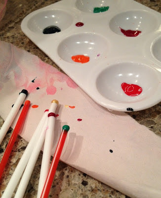
Now as to technique this time: I used these hot drink straws that are found in any local cafe or you can buy a bag of 100 for about $2 at the grocery store. I put a bit of paint (Golden Fluid Acrylics) into a tray and tapped the end of the straw gently into the paint, then moved it over the size and blew gently on the other end of the straw so the paint released onto the size as a tiny drop. This made all the difference. Most of the paints spread easily onto the size using this method even without diluting with ox gall or airbrush medium.
Also, I used a bit of Liquitex Professional Acrylic Ink (quinacridone magenta) which is beautiful but smells awful (like a skunk) - fortunately the smell goes away after it dries. It is suspended in a liquid solution that must contain its own dispersant since it spread wonderfully without the addition of ox gall or airbrush medium. I also used some Daler Rowney FW Pearlescent Liquid Acrylic (Macaw Green) that I had on hand. It also spread wonderfully on its own and left such a beautiful pearlescent sheen on the paper after rinsing and drying. Both the liquid acrylics come in bottles with droppers which eliminate the need to use straws or separate droppers. I plan to acquire some orange pearlescent liquid acrylic at my earliest convenience.

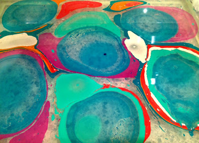
Isn't this a beautiful photo of the size with paint on it? Look at that nice, clean clear size! It stayed much cleaner this time because I was putting on much smaller amounts of paint. The colors were much more vibrant because I did not dilute them with water. If anything, I diluted them directly with the ox gall or airbrush medium. 
I also used eye droppers and little plastic cups to mix a bit of either ox gall OR acrylic medium (both seemed to have about the same effect on the paint). I made the little pink and gold circles that you can see in some of the photos after manipulating the rest of the paint with a nail (dragging it in rows up and down to create the swirls). I took a bit of paint on the end of a straw and blew a small bubble (about 1/2" in diameter to 1" in diameter) and touched it to the size. After awhile it popped on its own (or I popped it gently with the straw).

This was the first one I did in this round. I don't like the shapes or colors very much, but because I hesitated in several places when laying the paper on the size, I think I have the most basic understanding of how the Spanish style is done with what appear to be dark and light waves or lines.
I will say there was a slight issue with some of the paint not adhering entirely to the paper (this was an issue across papers). I wonder if it had to do with the dispersing agent (i.e. ox gall vs. airbrush medium). It's not like that all over each paper, just in some spots. I have been using an ox gall made for watercolor but I read somewhere there is an ox gall made specifically for marbling. I'm wondering if that made a difference in the suspension of the paint particulate, resulting in the failure to adhere in places..

I had fun with this. My favorites of course were the pinks and oranges at the top of this post for their bright lovely colors. I have several other papers to experiment with, including a medium blue Strathmore charcoal paper. And my size has been sitting in the refrigerator for several days now so I'll see how long it can last in there and still be useable!

Baby Quilt: Lazy Log Cabin

Here's a baby quilt I finished recently for a friend. It's like a lazy log cabin, so I'm calling it a Straw Hut! ha ha! It's about 38"x38". I hadn't finished stitching the binding to the back yet. My favorite square is the middle square. This quilt has some of my favorite fabrics including some old Jan Mullen Stargazey stuff from like 15 years ago...

Friday, March 8, 2013

Marbled paper: Process

I just made marbled paper for the first time! This one of my favorite results from my first attempt (using mixed media paper with alum). I used a small nail to create the lines.

I recently saw this post by Lynda at Bloom, Bake & Create on Marbling Fabric. I think her colors are just lovely. Of course I had to try it. I ordered some carrageenan, alum (aluminum sulfate) and ox gall. I was looking at information on alum and worried about possible deterioration (rotting) of the fabrics prepared with alum. That's a bit disturbing... I did find this article about use of alum in papermaking over the centuries, and limited proof that use of alum in marbleing has any significant negative effect on the paper over time. Not that I plan on the papers I make lasting for centuries. I suppose it's just the IDEA of it that's bothersome. Anyway, alum concerns aside, I pushed onward. I followed Lynda's instructions to make the carrageenan mix in a blender and let it sit overnight in the refrigerator. I added 1 tablespoon of powdered carrageenan to 4 cups warm distilled water and blended for two minutes, then poured it into the marbling tray (a rectangle plastic container) and put it in the refrigerator.

To prepare the mordant (alum) about an hour before marbling, I added 1/2 tablespoon of alum to 1 cup of warm water and stirred until dissolved. I used a sponge to wet the paper on one side with the alum/water solution, then allowed to dry and flattened under a tray in between some newsprint. I used less alum than the instructions said because I was worried about the rotting effects of the alum. Next time I'm just going to add the amount it called for. I think that affected the paint's ability to adhere to the paper.

I used a bunch of different kinds of paper, including a cheap mixed media paper from Michaels; printer paper; Arches 140lb hotpress; graph paper; basic blank newsprint; basic sketch paper; and another thicker paper (fine watercolor paper) like the Arches watercolor paper (but I don't remember the brand). I also put alum on some of the pages, 1/2 diluted amount on some other pages, and no alum on others, to see what would happen.

This is the first one I made. I don't like the shapes and there is a lot of white space (the paints did not spread completely) but the colors are the most dense of any of the papers. I did start diluting more and more throughout the process, to try and get the colors to spread more. This is Arches hotpress 140lb with alum.
This one also had fairly dense coloring. It's mixed media paper with 1/2 the amount of alum, and it was early on in the process. I'm wondering if I dirtied the size because of all the paint I was throwing in there. Maybe that affected the ability of the size to float the paints.
Here is one that resulted from using airbrush color (Golden, transparent airbrush color, Phthalo Blue -Green Shade). The result was different from the rest because the airbrush color pushed the rest of the paint out of the way. That was the effect I was interested in. This was on newsprint with no alum and it was toward the end of the process so the paint in the 'veins' did not adhere well to the paper. Most of the paint came off during the rinse (I rinsed every piece to remove the excess size from the paper - in some cases a lot of ink came off in the rinse, but I don't know how to avoid doing a rinse since I don't want the carrageenan to dry to the papers).
Look how gorgeous the size was toward the end. It's from all the excess paint in there. I really overdid it on the paint. That's because the eyedroppers I ordered didn't arrive yet so I was just spooning the paint on by the end. Way too much.
Here's another picture of the size with paint floating on it. You can see the swirls I made with a small nail. I couldn't be bothered to make a 'proper' tool just yet. Primarily I was interested in making the 'stones' of the Turkish pattern like the blue ones that resulted by using the airbrush color. But I couldn't help but try some swirls as well.
That was fun and I'll definitely be making a comb and other tools. There are some tutorials on the internet for making your own marbling tools using common household items. I did find a few small straws yesterday so I'll use them the next time around. By then my eyedroppers should have arrived. Hopefully that will address the issue of all that excess paint suspended in the size and floating on the bottom. By the way, when I poured out the size to rinse the container, there was a ton of wonderfully layered beautiful paint on the bottom that I pressed some newsprint strips into. It created some lovely impressions. Next time I'll do it with some better paper that's had alum applied to it.

Mixed media with alum:
Mixed media with alum (but prepared immediately before using, so the paper didn't have time to absorb the alum). Not sure what the white spots are from.
I mixed several drops of ox gall into each little container of paint. Throughout the process I became more and more generous with the ox gall. The first few passes I only used one drop per bit of paint. Over time I began to increase the dilution (with water) of the paint and increase the amount of ox gall I was adding (3-4 drops). Keep in mind I was only using 4-6 drops of fluid acrylic each time I would prepare a little bit of paint. It's still something to experiment with.

Here are a few more from the first batch. This one is just lovely, in my opinion. It's on mixed media with no alum. It's fairly obvious what the affect of no alum is to the paper - the paint doesn't bind well in the form of the lifted pattern. But look how pretty it is. So this is my nod to the idea that while there may be a 'right way' to do something if you want a certain effect, there really is no 'wrong way' to do something in art because you may enjoy the unexpected result of the 'wrong way' just as much!
Sketch paper, no alum (also really lovely, especially the magenta color and the 'clouds' of pale yellow in the below left corner):
Sketch paper, 1/2 amount of alum (you can also see where the paper did not lay entirely on the size, which gives me an interesting idea for creating partial pulls on papers with text or other illustrations):
Here is another one with the airbrush color. I like the colorful veins on this one but the blue color is still too dilute for my tastes. I need to find a way to make the color more intense. This one was also on newsprint.
The colors in this one are lovely and delicate. This is sketch paper with alum.
This is the other (mystery) watercolor paper with alum.
In sum, I really was just throwing down every color (8-10) for the most part without much coordination. I love all the colors, and when in doubt or experimenting I like to use all of them. I'd like to see a better intensity/vibrancy the next time, and I want to experiment with different designs in the paint. I also tried it using a few pieces of fabric without much success, due mostly to the fact that I was too lazy to pre-wash the fabrics as was recommended to remove any existing size. I did treat with alum, but when I pulled the fabric up off the carrageenan size, the paint was beading on the surface, due to the existing size in the fabric. I will try again. I don't plan to use marbled fabrics in quilting but could add them to a collage or make a small wall-hanging.


Additional resources: Here are some examples of different marbled paper patterns from the University of Washington library. Some of them are gorgeous. I particularly like the vintage 19th century marbled papers in the Turkish pattern. Some even have lovely gold leaf overprinting.

The Golden Paints website has some good points about testing paints for spreading speed. The Daniel Smith website also has some good points and some photos. They sell carrageenan, alum and ox gall.

Lessons learned: Use more alum. Try papers with more exposed fiber (I got some Japanese papers to try). Don't use so much paint (most of it went to the bottom of the size). Put the marbling tray closer to the sink (minimize number of drips to clean up). Lay out more drying areas in advance (this became critical about halfway through and had me daydreaming for the next few days about my fantasy studio layout to include a wet-working area with a huge industrial sink and counters and hanging area to clip and dry works, plus huge windows that look out onto a beautiful garden...