Look how fun this colored village is! I sketched some houses and churches and a few shrubs on white paper with pen, then imported it into Gimp, cropped it, changed the saturation, and inverted the black/white to make white lines. Then I added an alpha channel (black), then started filling in the shapes with color, and filled the background with white. Here's the original sketch.
I'll make a tutorial soon showing all the different steps. This is just too much fun!
Monday, September 30, 2013
Watercolor of Bird on a couch. Plus, a flower with grasshopper and a sketch of some houses and a boat
I had an idea of a striped couch and a bird sitting on it reading the paper, with a cinnamon roll on the side table. I wasn't sure how to deal with the crossed legs... I'll make another go at it soon.
Here is a pretty pink flower- can you see the grasshopper at the top right of the flower?
Here is a quick sketch of houses, trees and a boat, made from a photo I took:
And colored in Gimp:
Labels:
bird,
boat,
buildings,
flower,
grasshopper,
painting,
pen sketch,
photo,
striped couch,
trees,
watercolor
Monday, September 23, 2013
Birds playing Go-Fish: another bird painting
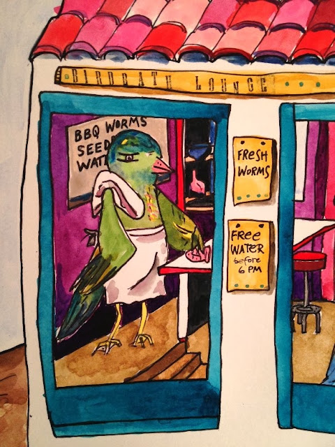
I've been doing the bird theme for awhile now, so a friend suggested I do a spoof of the "Dogs playing poker" paintings, but with birds. So here is my version: Birds playing Go-fish, at the Birdbath Lounge & Grille, and they have water, worms, and birdseed to snack on.
My favorite part, besides the tile roof and the colorful striped paneling on the side of the roof and on the door, is the bird waiter to the left, with his towel thrown over his shoulder and his pink sponge.
I also really like the red stool. And it's interesting how a few little lines for the eyes can convey 'personality' somehow. This was fun to paint.
Saturday, September 14, 2013
Friday, September 13, 2013
Painting collage "Window to Spring" with birds, tree and blossoms: Process Post
All week I've had this idea for a painting with birds and a tree and some pink and yellow. So here it is, with process photos. I started with a quick sketch to lay out the tree and bird areas:
Then I added a wash of some red/pink watercolor (technically, it's Quinacridone Rose) on top and some yellow ("mustard" color) gouache on the bottom:I pulled out the glass plate, brayer and water-based Speedball block printing inks and inked up a few stencils with pink and red (always a lovely choice):
I was thinking about what to do with the tree, and remembered this interesting marbled paper I made and talked about in this post from March:
I cut it up and used matte gel medium to paste it to the paper in the shape of a tree with a branch. Doesn't it give it a nice 'knotty' texture? I really like the bursts of lime green throughout:
Time to add some birds. I looked through my old photos of birds and re-sketched a few birds from previous sketches I had made, shown in this post from last year. This is one of my bird photos:
Here is a rough sketch I made of the bird, in the basic shape of the oval from my quick outline at the top of this post:
I made three sketches on paper and cut around the lines, then placed them over the painting to determine layout. I liked the idea of the one on the left looking back at the other two, and decided to make that the mother bird:
When I sketched the birds onto the painting I sized down the other two birds a little bit so they would look more like baby birds:
I added a bit of color to the birds while I thought about how to color them overall:
Then I started to add in some blossoms and leaves and other shapes, and add more color to the tree and finished off the birds.
I added details with a black fine tip Montana Acrylic Marker. There was an incident with the marker in the upper right when I brushed against some wet triangles with my hand - the stuff is like India ink and was pretty much impossible to control. I went over it with white paint but it just turned gray and became quite a mess. So I felt compelled to cover it with a bunch of color which changed my original idea to have those pink triangles up there. I decided to extend the orange color to the far left of the blossom/branch part to try and balance out the heaviness of the dark color on the right. Finally, I stamped on the letters: "WINDOW TO SPRING" and stopped there:
Saturday, September 7, 2013
More Gimp - digital manipulation and colorization of digital photos
I took the below photo and messed around with it in Gimp until I figured out how to remove the sky color. Then I cropped it and added in a bunch of wild colors. I like those little white houses more than anything.
Here is another one. This is just too enjoyable:
From this photo:
Labels:
digital image manipulation,
gimp,
little houses
Recent artwork
This started as a much larger piece of paper and I was experimenting with a bunch of media including gouache, watercolor, neocolor crayons, charcoal, acrylic etc. I also added some layers of ink with stencils. I didn't like the finished result as a whole, so I cut out the part I liked the most, which is this part:
I've also done a few art journal entries lately. This is just a portion of the entry, there are also some small houses and some stamped words.
This has a quote I liked from The Art of War (Sun Tzu): "While heeding the profit of my counsel, avail yourself also of any helpful circumstances over and beyond the ordinary rules." I used some gold and silver paint to highlight some parts and made marks over the paint with a marker.
Of course the 'leftovers' from printmaking can always serve to provide scraps for collage-making at a later date:
Labels:
abstract,
art journal,
art of war,
charcoal,
gouache,
ink,
neocolor,
printmaking,
stencil,
Sun Tzu,
tree,
watercolor
Thursday, September 5, 2013
Watercolor painting of a village on a hill with a bridge at sunrise: Process
I really enjoy drawing little Spanish-style houses on hills with trees and bridges. Here's a watercolor I did tonight, with some process photos. First I drew a rough grid with pencil on a piece of Bristol paper (rather thick and smooth, I find it's great for watercolor and the smooth surface works well for my Sharpie pen finishing details):
Then I drew lines for a bridge at the bottom of the page and a hill and tower at the top of the page:
Next I picked a perspective point off to the left of the tower and drew lines coming out on this side of the bridge to guide me later in the light/shadow of the water reference to the bridge. And I added in buildings and foliage, roughly following the lines on the grid for building placement:
Then I erased most of the grid lines and added a bit of detail on the roof of some of the buildings and brickwork on the bridge:
I got out my watercolor paints and brushes and filled a big Mason jar with water. I have a pan of Lefranc & Bourgeois paints that I love because of how the colors dry fairly well-blended. The white is completely gone and so is the bright yellow. I can't find a replacement anywhere and the tube paints that I use, while vibrant in color, do not dry the same. I've tried two other pan-style watercolor sets and I haven't been pleased at all with the consistency of the paint after it dries.
I started with the sky and did a nice wash for a colorful sunrise with the lightest part (white) being at the perspective point on the left side of the page. I added in some color on the buildings and bridge:
Next I worked on the buildings and started on the foliage:
I worked on the foliage in the village and added color to the bridge. I started on the water, which I always find particularly challenging.
Then I worked on the hill behind the tower - I didn't extend the bridge or the village beyond the grid but filled in the sides with the color of the hill - I'll just crop the final image.
Next I finished off the coloring, including a village center (light gray) or courtyard in the middle of the village.
Then I finished it off by adding in some black ink marks with a fine tip Sharpie marker, including adding detail to the bridge and some of the roofs. I detailed around the doors and windows and added a bit of detail (tree branches) to the foliage:
Labels:
bridge,
how-to,
Lefranc & Bourgeois,
marker,
painting,
process,
Sharpie,
tutorial,
village,
watercolor
Wednesday, September 4, 2013
New York City skyline with Gimp
I've been going back through old photos I've taken of buildings to see how to draw the outlines and shading of buildings for a painting I'm working on. But I got sidetracked having too much fun in Gimp! There are so many things you can do with your photos using Gimp. It's like Photoshop, but free.
Here's a photo taken from the roof of the Metropolitan Museum of Art in New York City. I opened it in Gimp, cropped it and messed around with the hue/saturation/color etc, flipped the image, converted the image to black/white, then used Threshhold to get rid of everything except the black pixels. Then I created a transparency, added a new layer and made a light blue checkerboard and merged the two layers again.
I like all the little windows and lines on the buildings that were retained during the manipulation. That's one of my favorite parts, to be able to see all the little details. I basically created a little piece of digital art from a photo - isn't that cool?
Labels:
digital image manipulation,
gimp,
new york city
Subscribe to:
Posts (Atom)


