
Wednesday, February 26, 2014
Hexagon quilt?
Tuesday, February 25, 2014
Gelli plate plus: online class by Carla Sonheim

Now I'm taking a mini online class by Carla Sonheim called Gelli Plate Plus. I've used a gelatin plate once before and posted about it here. That time I made my own plate out of unflavored Knox gelatin. Subsequent to that I started using a sheet of glass to do printmaking-like things. I wouldn't quite say 'printmaking'... Here are some of my exploits in printmaking: where I played around with leaves; printing with ink and stencils; and monoprinting with cut paper.
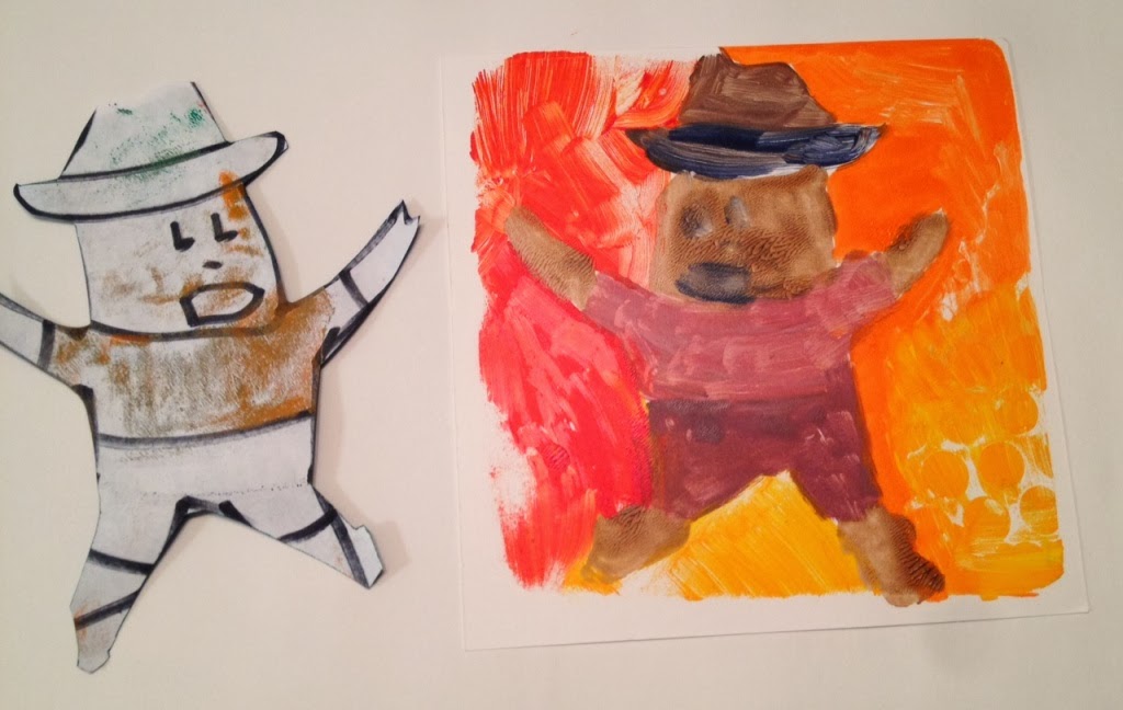
I did buy a gelli plate (a small one, about 6"x6") after my adventures with making my own gelatin plate, but I hadn't ever gotten around to using it. So I pulled it out and followed the instructions/ideas in Carla's class video. I decided to use the idea of my sombrero man from last week's class, and traced around him and cut him out to use as a guide for painting under the gelli plate. I used a bright orange C.P. Cadmium Orange Golden Open Acrylics paint, which is the orange in the left side of the plate in the picture below (so on the right side of the pull at the top of this post) - I absolutely ADORE this orange- it's fabulous and exactly the orange I've been looking for all my life! Seriously, though, I really have been looking for a brilliant vibrant orange. So I'm REALLY EXCITED about this one.

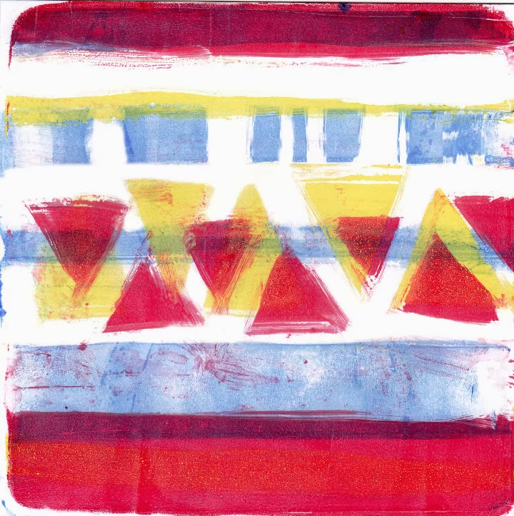
Then I painted onto the plate and pulled off a print. I made 5 prints total after adding subsequent layers of paint to the plate. My favorite is the first one (top left). But they all look so colorful especially when placed together like this:

I used an acrylic medium slow-drying blender to increase the amount of time to work with the paints, since the only 'open' paint I have is that new orange acquisition I raved about earlier.
 Here are some 30-second sketches I made the other day. I want to work on faces. I sketched the face shape then decided this guy looked like he should be a chef so I added the jacket and hat (and mustache):


And this one is a doctor, which of course is obvious by the stethoscope around his neck:

Happy Art-making!
Edit 2/26 - here are two prints I made tonight for Exercise 2 in Carla's class, using a three-color transparent layer technique. After I scanned these, I used the eraser in Gimp to clean up a bit in between some of the marks where I didn't wipe down the plate completely... so consider this traditional printmaking plus digital editing- ha!
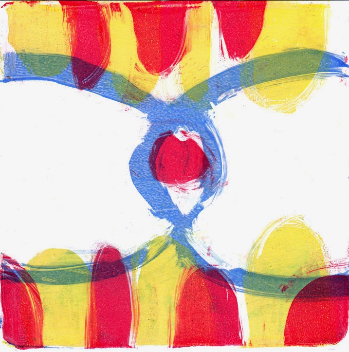
Edit 2/26 - here are two prints I made tonight for Exercise 2 in Carla's class, using a three-color transparent layer technique. After I scanned these, I used the eraser in Gimp to clean up a bit in between some of the marks where I didn't wipe down the plate completely... so consider this traditional printmaking plus digital editing- ha!


Saturday, February 22, 2014
Bird & Dog All Year - collage/painting Process Post


I enjoyed the week-long class by Diane Culhane and would recommend it to you if you're looking for a few fun and simple exercises to spark your creative/colorful mood or just want to learn some new techniques. I'm calling this 'Bird & Dog All Year' because even though you can't see Bird and Dog in this painting, seeing their houses makes me think about the interactions of bird and dog all year, Dog watching Bird, Bird watching Dog, Dog chasing Bird, etc.
Thursday, February 20, 2014
Online art class: Diane Culhane's Between Speech and Silence


Edit 2/21 - here is my finished painted collage of the sombrero man:

Monday, February 17, 2014
Puzzle quilt: process post/Tutorial
I've made this kind of quilt three times now. This was the first one:
 then as a green/blue/yellow quilt for a baby:

 You can read my post about my process using EQ6 software to sort out the idea for Patriot's Puzzle in case you're looking to do a similar thing and can't decide where to start, i.e. what fabrics to use, how many of each fabric, etc - keeping in mind that you don't need any special software - you really can just pull out some paper and colored markers. I still do that, sometimes using graph paper when I'm first considering a design or layout.
Yesterday I pulled out my stash and sifted through it, looking for some kind of inspiration for a baby quilt (the one I've been trying to design for a stack of gray fabrics) - the baby is due in a few weeks so I'm really feeling like I need to just settle on something. I decided to pull out every color that was not 'girly' since the baby is a boy. I made a pile of every blue, green, yellow, and black fabric, as well as a few oranges, reds and purples that read as blues and grays. Here is the pile:
 Well, as nice as it is to have a pile of fabrics to work with, it really wasn't very helpful in getting me closer to my goal of picking a design. So this morning, after mulling some more about the idea of the quilt, I sat down again and sifted through the pile, pulling out anything that was not blue or black. There were some greens that begged to remain so I sorted my final pile into things that read green, things that read turquoise, then blue/purple, grayish blue, straight blue, black, gray and white:
 As I was sorting them like that, my mind went back to the green/blue/yellow baby quilt and I decided I would make another puzzle quilt with these fabrics. I used EQ6 to change the coloration on the green/blue/yellow baby quilt to more of a gray/blue with some green:
 I plan to leave the white-on-white border area and there won't be as many greens as show up in this mock-up. I will also add in a significant amount of gray/black, especially prints that read one or the other, so I will probably leave out some of the busier black/white prints. Now I'll make another pass through the rows of fabric and weed out anything that screams too busy or not right. Then I'll make sure I have enough lights, enough darks, and the rest mediums. Here's another mock-up with more blacks/grays/blues (keeping in mind how incredibly limited the palette is of 'fabrics' in EQ - I think you can upload or import additional fabrics but I haven't done that so I've only got about 3-5 of each color to work with):
 I think the real visual impact of this type of quilt is accomplished by ensuring sufficient contrast in value (light vs. dark) in the pieces and how they are matched up. This is done in three steps - 1- ensure you have true lights and true darks (if all your selected fabrics read as 'medium' value, you won't achieve the necessary contrast); 2 - when pairing up the squares to be sewn into half-square triangles, make sure some of the lights are with darks, some mediums with lights, some darks with mediums, etc; and 3- arranging the squares on the design wall - I can spend hours and hours on this part (spread over weeks and months), rearranging until the placement is visually pleasing to me. For me, I like to have stark contrasts of light vs. dark, but then parts that blend together so that the dark/light parts really do stand out compared to the overall quilt. But I do also like to create a balance, so that one side isn't 'heavier' visually speaking, than the other, as a result of the contrasting fabrics.
I'll post Part 2 later, once I've picked out which fabrics I've used and once I've cut the squares for the half-square triangles (follow the link to find a tutorial for making half-square triangles). If I cut 6" squares, then square up the half-square triangles to 5.5", each finished square would be 5" (since it's 10 squares x 10 squares), so the finished quilt (without a border) would be 50"x50", a fine size for a baby quilt. I only need to cut 100 squares for this quilt, but I'll cut 120 to give myself some variety for the design wall auditioning process. I just counted my rows of fabrics and there are 202 - so that's plenty to choose from and narrow down to 120. I think at this point it really does become an intuitive process- I sift and sift and just keep getting rid of things that don't 'feel' right for the project.


then as Patriot's Puzzle (the red/white/blue quilt):

Yesterday I pulled out my stash and sifted through it, looking for some kind of inspiration for a baby quilt (the one I've been trying to design for a stack of gray fabrics) - the baby is due in a few weeks so I'm really feeling like I need to just settle on something. I decided to pull out every color that was not 'girly' since the baby is a boy. I made a pile of every blue, green, yellow, and black fabric, as well as a few oranges, reds and purples that read as blues and grays. Here is the pile:


I'll post Part 2 later, once I've picked out which fabrics I've used and once I've cut the squares for the half-square triangles (follow the link to find a tutorial for making half-square triangles). If I cut 6" squares, then square up the half-square triangles to 5.5", each finished square would be 5" (since it's 10 squares x 10 squares), so the finished quilt (without a border) would be 50"x50", a fine size for a baby quilt. I only need to cut 100 squares for this quilt, but I'll cut 120 to give myself some variety for the design wall auditioning process. I just counted my rows of fabrics and there are 202 - so that's plenty to choose from and narrow down to 120. I think at this point it really does become an intuitive process- I sift and sift and just keep getting rid of things that don't 'feel' right for the project.
Sunday, February 16, 2014
Log Cabin?
How about one of these old-school log-cabins for the gray fabrics? These all look the same except how the blocks are rotated and the way I put in the colors was random.


 These colors have the same placement in each block - I don't like it. I mean, obviously there are limitations with EQ6 versus using real fabrics for a mock-up... But I think what is really causing me difficulty in settling on a design is my limitation in just using gray - no color! That is completely foreign to me...

 Or perhaps something like this:
 Or here is a take on Robbing Peter to Pay Paul, using triangles instead of circles - this goes from all darks in the inner box and all lights in the outer box in the upper left, to all lights in the inner box and all darks in the outer box in the lower right:


Saturday, February 15, 2014


Sunday, February 9, 2014
Dimensional Chevron quilt: Process post


Here is a colored version with a border that allows for termination of all the pieces in their entirety - though I really don't like that top middle and bottom middle part - not sure what to do in that space. Any ideas?
Sunday, February 2, 2014
Squares
What about this for a quilt?
 This is based on this doodle I made years ago:
 More color options:


Subscribe to:
Posts (Atom)